Snapshots of the design system
I designed an in-house platform for the American Board of Medicolegal Death Investigators in 2020-21. The platform serves the purpose of storing/managing/sharing all the death investigation cases throughout the USA under one roof.
View Client
Setting The Vision
The first step before laying a foundation for the design system was to define a vision for the product through the lens of design. It took me 2-3 days to come around with a mood board research after many backs and forth discussions with the stakeholders. It was time to outline the discovered personality of the product.

Glimpse of the research on a mood board
Choosing Typesets
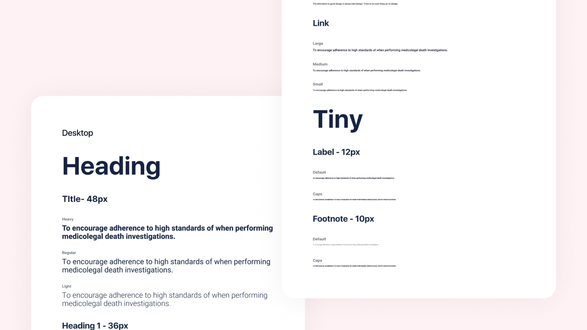
As per the key traits of the platform to be modern and clean, A sans-serif was best suited for the job. The next deciding factor was to find something with high enough contrast to deliver legibility for a broad range of font sizes as well as cross-browser support for quicker page loadings.
Few typefaces that made the cut from my list of favorites and are widely accepted as well like Muli, Roboto, Proxima Nova, SF Pro Text, and Graphik. The decision was still not easy to make among these. Further, I went to dig deeper into the nerdy details like vertical parameters (x-height), stress, etc. Comparing the outsets then I closed down to go with the universally available google font Roboto (+RCondensed) for the main body copy & Source Code Pro for the mono use case.
There is more granular reasoning behind choosing these sans serif typefaces. I won’t be able to put all those details here as I’m trying to keep it crisp. That’s something you learn as you grow as a designer. If you’re interested anyway, here are a few articles that I would recommend you to go geek out on the subconscious effects of typography :)
View knowledge resource 1
View knowledge resource 2

Typography

Grids setup for the mainframe.

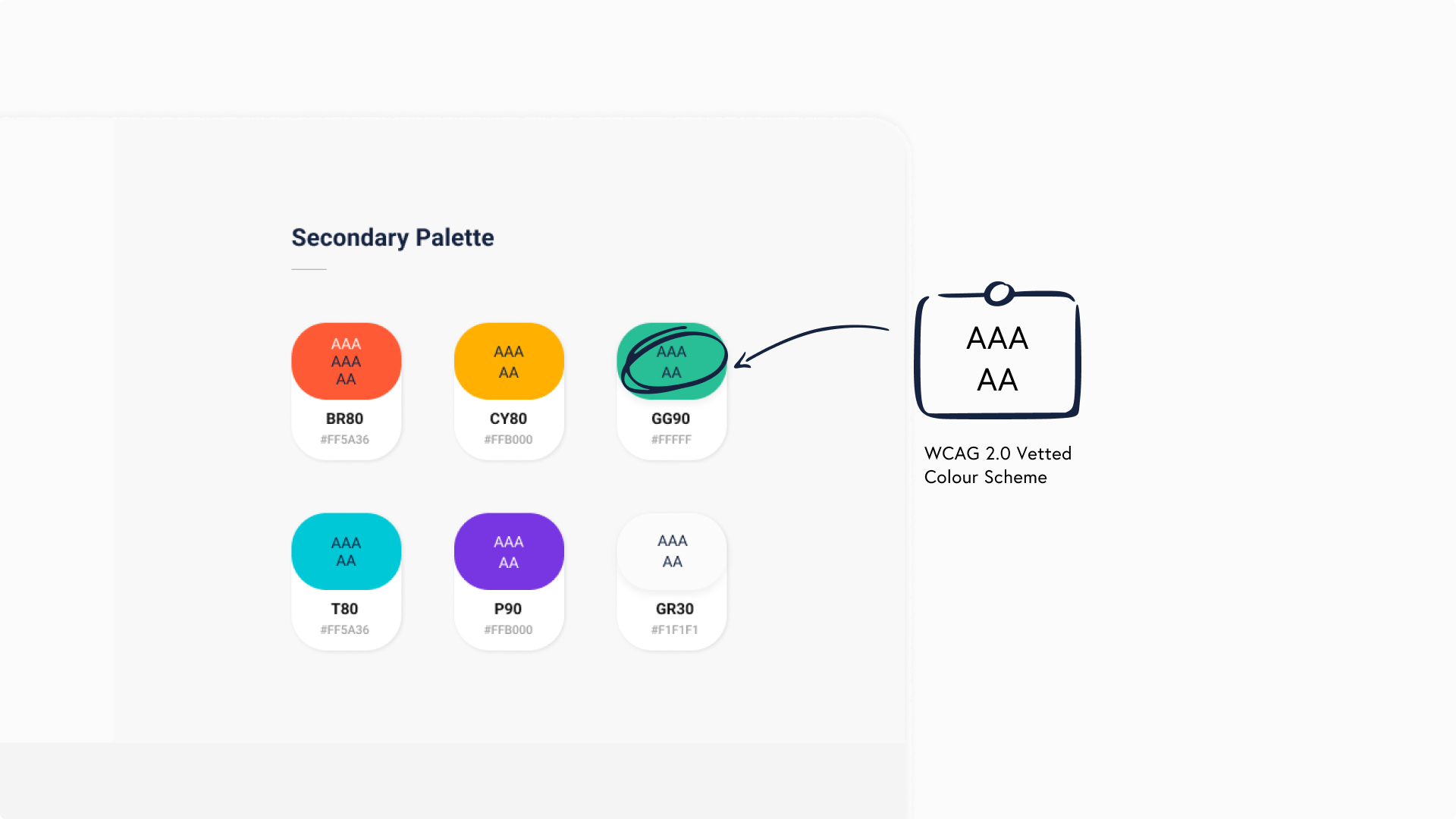
Color palette.

Accessibility standards for the color palette.

Icon components.

Tokens & primitives

Functional components.