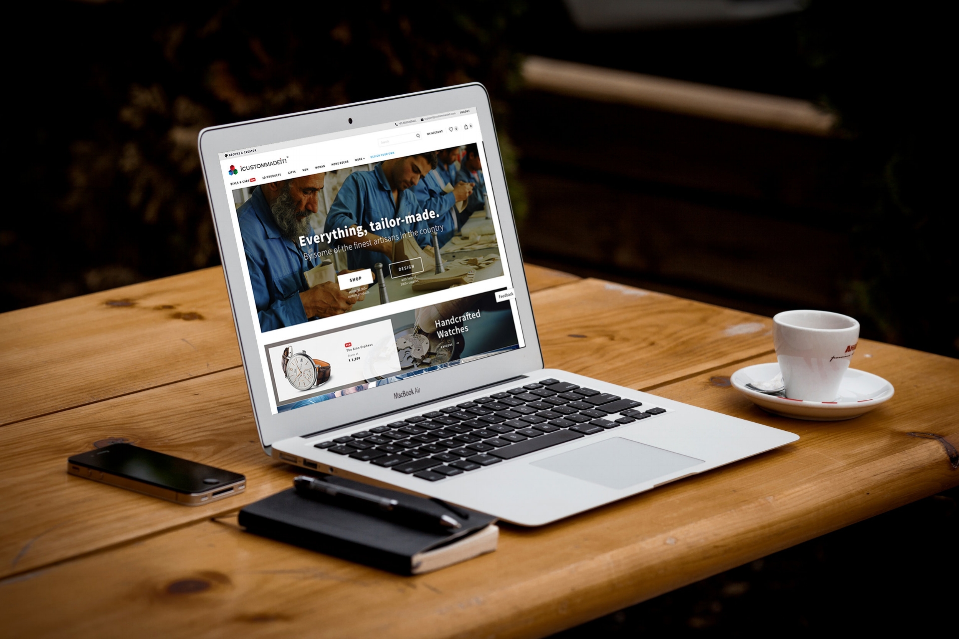
Icustommadeit
A new e-commerce company was about to step into the limelight. Their brand was all about art and impression, with a platform for the Indian market to buy on-demand & personally customized products online.
MY ROLE
I led the design of Icustommadeit for the digital e-commerce across Web and Mobile since the outset of the project.
I led efforts to evolve the service and address customer pain-points to the browse, discovery and buying experience.
Customer insights & ideation
I partnered with one project manager, one marketing head and one other lead designer to uncover insights and translate concepts into features that address customer behaviors and motivations.
Experience strategy & vision
I created frameworks and prototypes to share the vision, design principles and content strategy. This helped to evangelize ideas, gain alignment and drive decision making.
Planning & scope definition
I defined the product with my project manager partners. I evangelized customer goals and balanced business goals. I prioritized and negotiated features for launch and beyond.
Oversight & Coordination
I designed across and collaborated with two platform designers and their PM partners to translate product features for each platform context.
Design execution & validation
I designed down on web and mobile Digital e-commerce. I executed journeys, ideations, wireframes & prototypes.
Leadership
I designed up and presented works to gain buy‐in from executives, senior stakeholders and many other Icustommadeit teams throughout the project lifecycle.

THE CHALLENGE
CREATE DEEPER RELATIONSHIPS WITH CUSTOMERS
Since 2010, e-commerce handcraft sales have rised and now a sizable portion of the handcraft industry's revenue is made up by on-demand services. For Icustommadeit, this signaled a rapid change in buying handcraft habits.
Our challenge was to evolve with customers and enter the highly competitive on-demand handcraft products market in India.
Icustommadeit would offer a limited collection of a hundred of products and catalogue titles, exclusive for ordering in advance and buy later options. With this new benefit we hoped to create deeper relationships with handcraft loving customers.

THE APPROACH
GOOD FAST CHEAP
In favor of speed to market, we were tasked to design and build Icustommadeit within the existing e-commerce store architecture. This tactic was perceived to be advantageous and the least riskiest.
Assumption was simple, thousand of people shop online daily on e-commerce in India. On the other hand the love of handcraft items is always there. A strong compelling story needed to build around the current infrastructure of Icustommadeit. Extend the acquire, explore, manage conceptual model that customers were familiar with and leverage that to get to the market sooner and cheaper.
This early architectural decision had a major impact on the quality of the customer experience we could create and reconcile.
CHASING THE CURRENT
Feature design and development were broken into parallel work streams for the Web and Mobile. I led the design for all aspects related to the store.
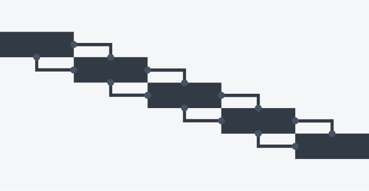
Each feature phase of the project was serialised, starting with the design and development for the reference platform - Web. Once feature was designed and approved, the engineering team began the implementation.
I followed by working with platform designers to translate product features for their platform’s context. Concurrently, I would design the next feature in the pipeline, whilst also working with my own platform engineering teams to execute the current feature through to completion.
“The combination of a fixed launch date and aggressive scope created an intense environment with many coordination and time challenges.”
Working backwards from a fixed launch date, meant that design was subsumed into an engineering-driven process. Sign-off milestones were driven by engineering estimates and time to create the right design was the time left over.
THE DISCOVERY
CUSTOMER INSIGHTS
We conducted customer and market research to drive our planning phase. These are the key insights that defined the launch version of the product:

Lean-back & Lean forward
The primary segments are customers that buy spoon‐fed products and customers that actively control what they want to customize.

I want to be special
Getting limited edition customized products was the motivating factor for customers switching to hand-crafted services.

Clear the details
Users are confused about the exact pricing ( is it ready made price or customization cost ? ) & delivery time of the products in showcase.

I need trust
Before buying, trust is the most crucial factor for the users on the platform. They need facts to trust Icustommadeit.

Empathy behind the scenes
As products are not so cheap on the platform. Customers want to believe in the quality. So, it is necessary to embed user empathy with creator's hard work & dedication.

Show me you know me
Customers expect Icustommadeit to know them and serve personalised product recommendations.
THE VISION
THOUSAND PRODUCTS, UNLIMITED CUSTOMIZATION
Our vision for Icustommadeit was to be the best value handcrafted online service for Indian customers.
We did not want to offer an exhaustive collection of products only, rather wanted to focus on helping customers discover products they'll love, from a selective range that they will actually want to customize and buy. Our customers expect and trust us to know them. We envisioned the future of online handcraft service to be deeply personalized to customers' desire & showoff tastes.
Value is what we wanted our customers to shout about.

THE SERVICE
INTRODUCING ICUSTOMMADEIT
Icustommadeit is a personalized handcrafted online products service provider in India. One can buy and customize from a catalogue of over thousand products, hundreds of curated limited edition and personalized collections.

Turbocharge your desires
Customers can customize any product, add it to their rare showoff collection, take it ready made or mix with their personal taste.

Choose your style
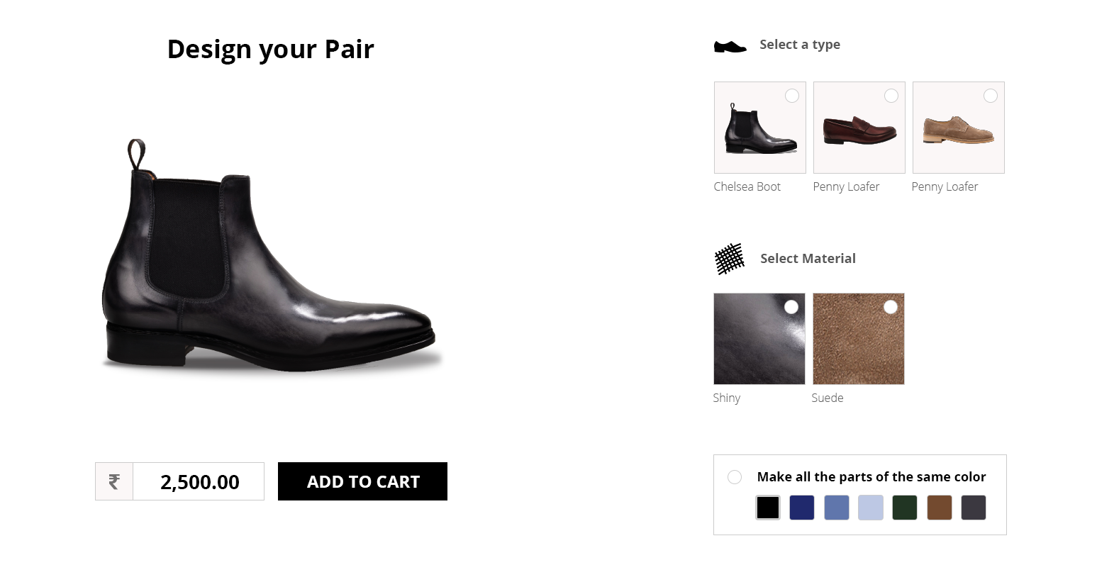
Customers can modify their own products or can select from a large variety of ready-to-customize products.
Build with freedom
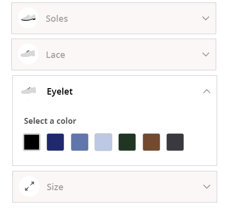
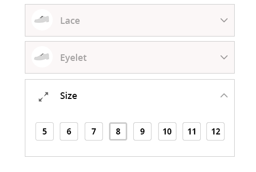
One can customize or even build their own desired product online from scratch with tens of options available in the applet. Build from scratch feature is kept available only on selected luxury products like bikes, shoes, dresses.
THE FRAMEWORK
HOW WE GOT THERE
The biggest challenge i faced throughout this project was balancing moving forward with designs, whilst collaborating with the wider team. Since this project touched ever part of the handcraft business, I needed to coordinate and get buy-in from many teams that were both co-located and distributed. This was hard.
Managing feedback was even more challenging because it felt like a swinging pendulum of viewpoints. The team spent a disproportional amount of time debating design decisions— when there wasn’t data that could easily be gathered to help drive a decision.
The impact was agony, paralysis and a growing skepticism for instincts in the design process.
“Managing feedback was even more challenging and felt like a swinging pendulum of viewpoints.”
I observed this pattern early enough in the project and invested time into creating documentation to help alleviate the data crutch and better articulate and distribute design rationale. Doing this upfront was quite time consuming, but saved a lot of back‐and‐forth as the project progressed

Content first
My earliest design challenge was to propose how we would display content in our online store for both web and mobile customers.
I hypothesised that the priority of customize‐eligible content would be different if a customer did not have a high intent to purchase. I did not have qualitative data to support this and subsequently performed a hierarchical card sort with six participants. My aims were to understand how customers thought about different categories of content and what was most important to them in the context of icustommadeit platform.
During the think‐aloud I was surprised to hear participants ranked content based on what they felt was predictable and could trust as relevant, what made them curious and finally what they were skeptical about or had the desire about.
Now, we needed to prioritize navigation content and that categories was a familiar tool for customers to browse content. I combined these two concepts to design the header navigation browse experience. I then coupled it with feasibility scores to create the rest of the browse structure.
The pain in bike customization
There was a long time consumed in figuring out the exact problems for letting the users and what they exactly looking for. Pointing to a particular solution seemed easy but I spent more time defending or these design decisions than solving the design problem! It was difficult to decide the features from the development team's point of view also that what level of freedom should or can be allowed on the platform to the customer. Almost two weeks were spent in testing and validating its feasibility.
The three areas that were most debated related to:
- what should a bike lover see in front
- what options for customizing, they exactly need or looking for
- why they want to modify their vehicle
I started my design process with the Think, Do, Feel exercise. However, rather than using observed behaviors, I worked backwards from the aspirational thoughts, feelings and actions I was designing for.
After weighing up the strengths and weaknesses of my explorations, I narrowed down to the following design concepts:

“…I felt good enough to move forward with the step by step design because I knew it would be easy to pivot, if needed.”

Product page
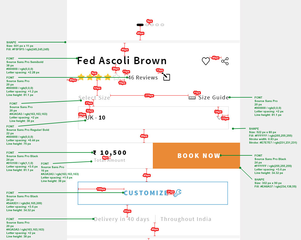
The next step was to engage the customers for the products they are interested in. The product page was not an easy to do task. As, for every category of products it required different options and approach to satisfy user needs.
For this purpose the default approach was taken at the first step from various successful e-commerce platforms. The most obvious needs of the user were kept in mind and we made it available to the front. It worked fine for most but still something was missing.
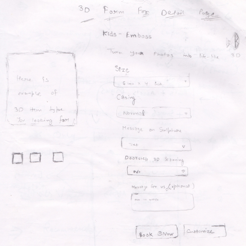
From delivery to product's price everything was necessary in the layout which required tens of ideation and team sessions for the final model. With heavy sketching ideas, their testing and iteration took us finally to the final layout design.
Hi-Fidelity wireframing

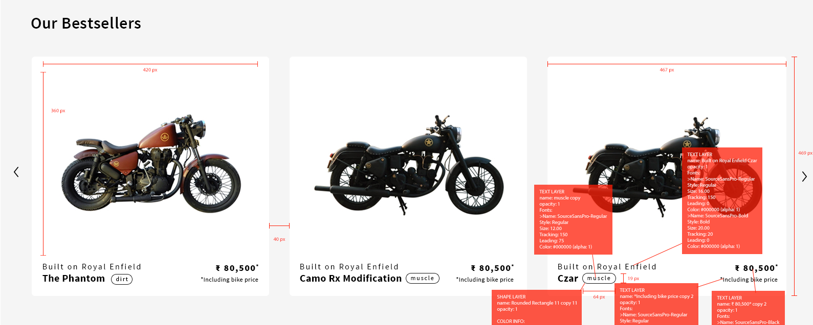
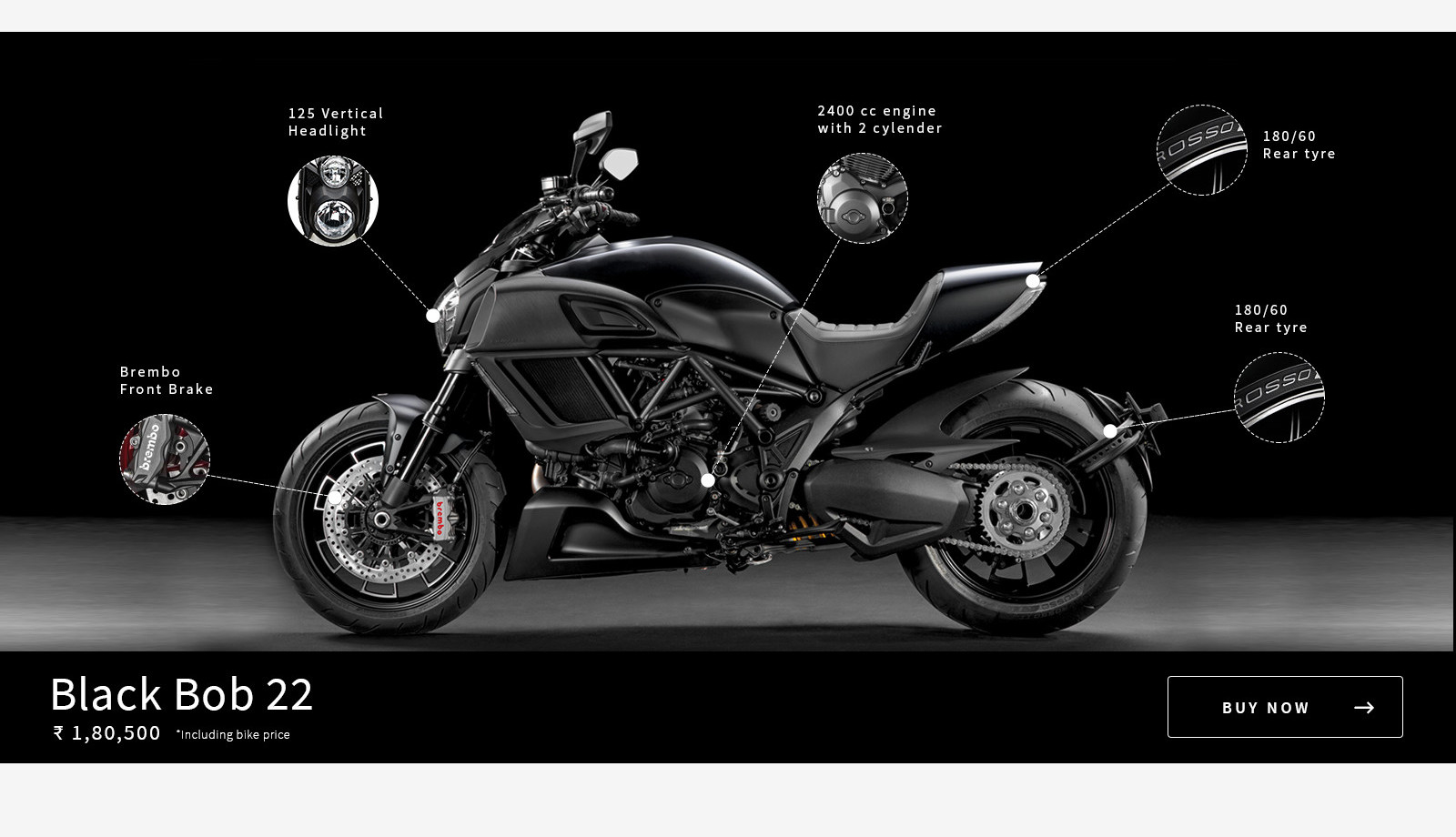
Here is the final output of bike product page after many iterations in it by the team.

DETAILED DESIGN
COMMUNICATING DESIGN
Icustommadeit upholds infamously high standards for the work it produces both externally for customers and internally for team members to consume.The sheer size of this project and structured waterfall approach meant that I needed to have everything figured out before teams would commit to moving forward with the work. Many teams involved in the project needed to see it in a tangible document. This risk averse mindset meant I created a lot of reference documentation that was widely distributed and a high overhead to maintain.
“Prototyping was the most effective way to gain meaningful feedback…”
- For each feature phase, I went through cycles of requirements, consensus, approvals, detailed specs and handoffs.
- My process involved sketching and white‐boarding concepts and flows with my PM partner and then translating these directly into hi‐fidelity design comps. Since I was working with many existing design patterns, it was relatively easy to move straight into hi‐fidelity designs.
- My next step involved slicing the comps and piecing them together with Marvel or Invision into a prototype. In the early stages I focused only on representing the highest risk areas of the design. Later phases allowed me to focus on micro‐interactions.
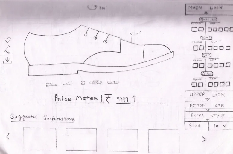
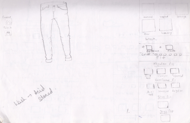
- All the remaining core customization range of products of the platform like furniture, shoes, jeans, 3D printing were then brought to light. I made plenty of research and team decisions to finally give life to the whole platform. It took nearly a month for creating a base for these variety of in-house strengths. My most of the discussions were with marketing and support team as they were closest to the real user base.
- Then i made wireframes & prototypes for it. I was able to easily distribute these as videos and recycle them for Usability Testing. After that final design development started with heavy documentation and style guides. After that, our visual designers set the design specs for the whole infrastructure.

THE EXECUTION
BRINGING IT ALL TO LIFE
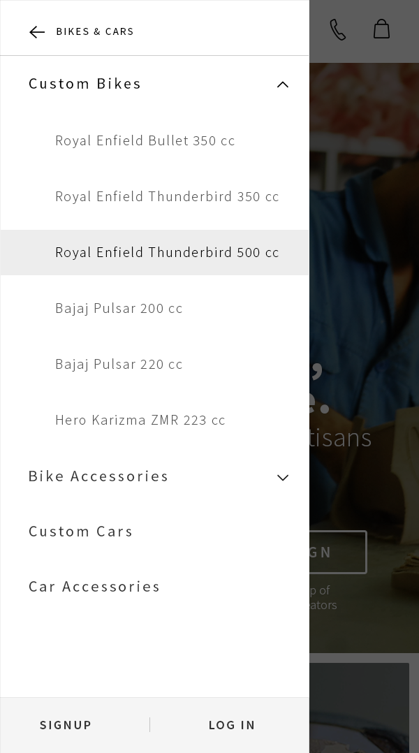
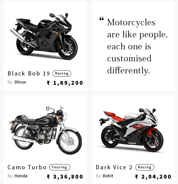
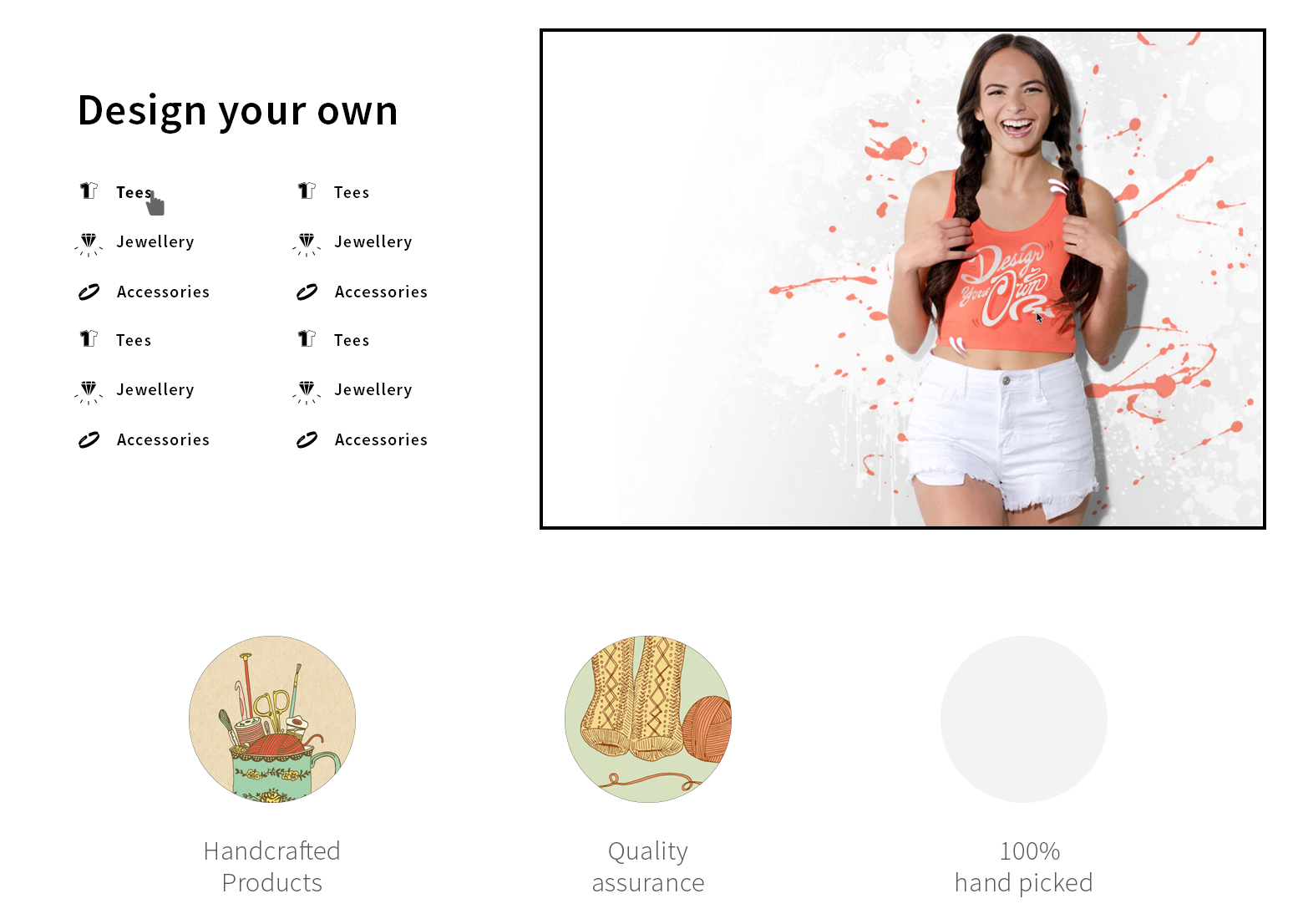
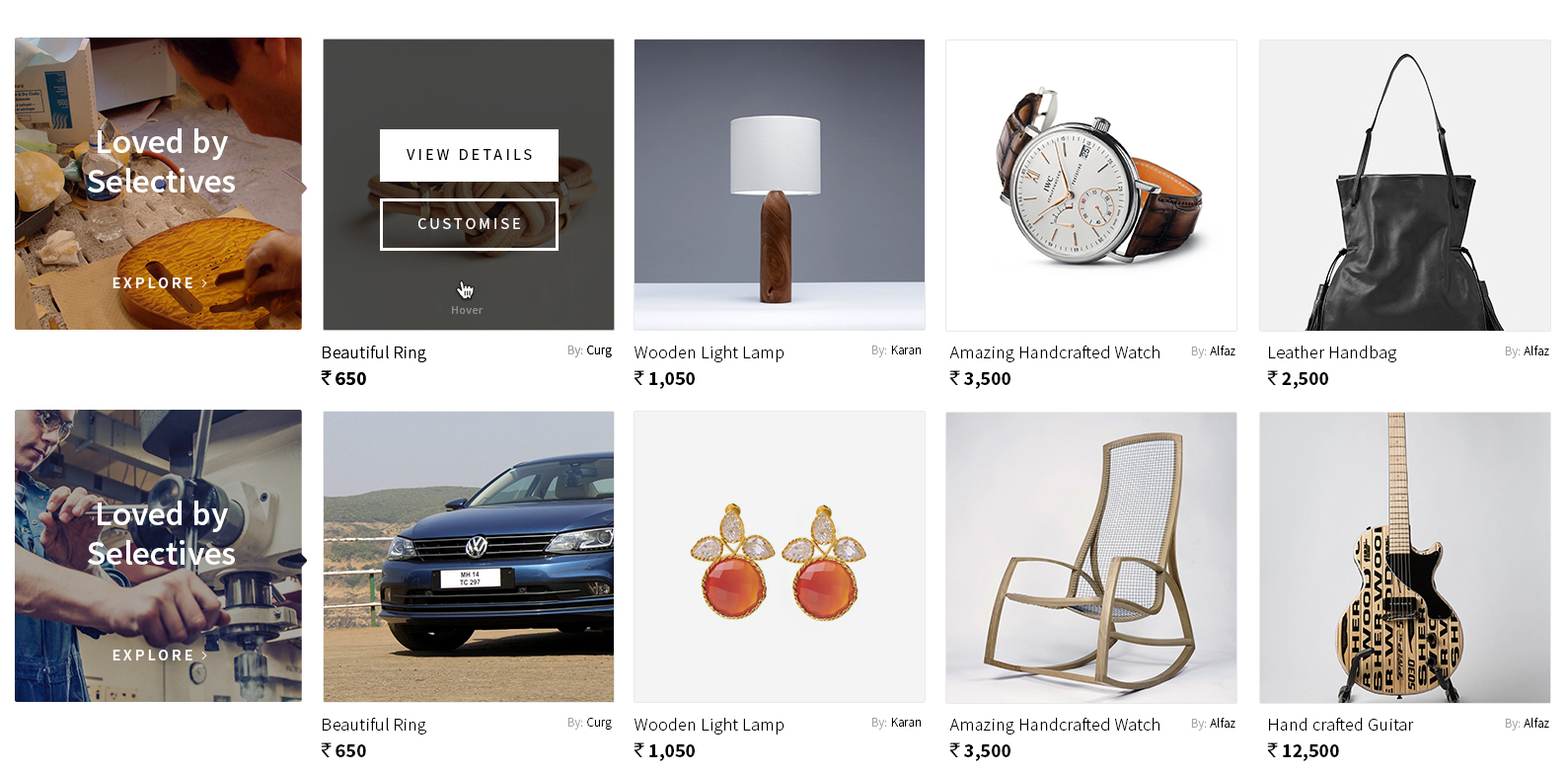
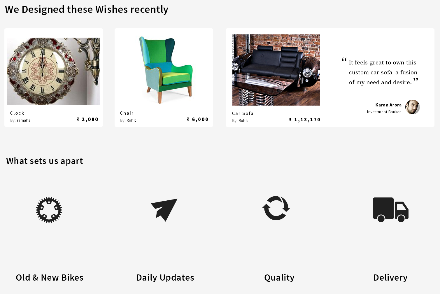
The gallery below shows some of the designs for Web and Mobile.
THE REFINEMENT
LAST MINUTE PIVOTS
The product team divided into smaller teams to investigate the top categories for customer feedback and develop a proposal to address the top risks by launch.
Way-finding
We observed that customers had difficulty finding customization; felt disoriented in the mobile app; and could not re‐find the progress they had created. These issues were inextricably linked and compounding.
This heavily influenced their expectations and behaviours, which meant the experience was very difficult to use. So, this issue was tackled upfront and then
......we released in parallel.
THE LAUNCH
PULLING THE TRIGGER
On the evening of July 15, we began rolling‐out Icustommadeit first updated version for mobile and desktop. The launch went off without a hitch—An amazing achievement considering the scale and complexity of the deployment.
THE EVOLUTION
A NOT SO FAST FOLLOW
Whilst the hype from the launch was settling, we kept a close eye on our customer listening posts. We knew that there were big gaps in the product and needed to form a plan to prioritize fixes.
Fortunately, the pressure of the launch was behind us and we were able to carve out the space and time to do things right.
Strategy with tactics
I spearheaded a research plan to gain deeper qualitative insight into the product pain‐points and to look for opportunities to evolve the product. To disseminate the research learnings, I created a customer journey map.
“We had finally created the minimal desirable experience for our customers.”
THE IMPACT
A GOOD START.... AND ITS STILL DAY ONE
Viability should have been defined by our customers way before the technology and date already did.
"Loved my custom purchase from icustommadeit! Also, I like the customer support provided throughout my Project. I got very prompt and quick response from her on all my queries throughout. Will look forward to deal with you further."
Inderjeet Kaur - Terracotta Necklace
"Hope they maintain the same type of customer relationship and gain more satisfied customers. Would be getting more customized stuff. Thank you, Manali and icustommadeit team"
Rajesh Surya - Custom Wallpaper
LAUNCHING IS THE ONLY BEGINNING
My dissatisfaction is not a case of perfectionism, but rather an insistence for quality. Quality that should never be compromised, even in the first version of a product. Quality is the responsibility of an entire organisation and I have learned that magical experiences are only possible if the whole team truly shares in the same values and aspirations.
Fast forward to the present, and I realize that my satisfaction and insistence for quality does not seem to matter at all. The success of this product had nothing to do with how I feel, but everything to do with if and how the product is being used.
